Despite its reputation for dry content delivery across virtual and in-person meetings alike, PowerPoint remains the go-to choice for many professionals, even as other options emerge that offer greater usability and flexibility outside of the Microsoft ecosystem.
Part of the presentation platform’s popularity stems from its familiarity — many organizations still run Microsoft-first IT software environments, making PowerPoint the obvious choice for straightforward presentation design. Simplicity provides the second part of this popularity permutation since creating a basic PowerPoint presentation on a single topic requires minimal time and effort.
The problem? “Simple” doesn’t always mean “effective”. Staff across markets, industries, and verticals worldwide have stories about unbearably long and boring PowerPoint presentations that were long on details but short on value. The 7x7 rule offers a framework to help boost PowerPoint form and function by reducing text volume and improving information impact.
In this piece, we’ll break down the 7x7 rule in PowerPoint, best practices, and offer some actionable examples of seven-by-seven solutions in-situ.
The PowerPoint Problem
To put it simply, most viewers don’t like PowerPoint. While the format has the benefit of speed and convenience — and can conceivably be used to communicate information quickly and concisely — many presentations are overlong and overwrought with bonanzas of bullet points that seem relevant but are really just digital hot air.
In most cases, the disconnect between appearance and action is boring at best and irritating at worst. As noted by the BBC, however, in extreme cases — such as NASA’s Challenger shuttle disaster — overlooked information in an overstuffed presentation can have significant real-world consequences.
Best bet? To avoid PowerPoint frustration and fatigue, it’s time for a new framework: The 7x7 rule.
What is the 7x7 rule in PowerPoint?
The 7x7 rule is simple: For every slide, use no more than seven lines of text — or seven bullet points — and no more than seven words per line. Slide titles aren’t included in the count.
There’s no specific data supporting the 7x7 model as the ideal; some PointPower proselytizers consider 8x8 good enough while others say 6x6 is more streamlined. The point here isn’t the hard-and-fast number but the underlying idea: Cut out extraneous information to improve presentation uptake.
Slides can still contain images — and should, wherever possible — but sticking to the 7x7 rule helps cut down on excess data that might be better-shared in follow-up emails or one-on-one discussions. In effect, the 7x7 rule is a way to reduce the amount of time staff spend pretending to care about PowerPoints and instead help them focus on slide information that’s relevant, contextual, and actionable.
Best Practices for the 7x7 Rule in PowerPoint
Building a typical PowerPoint slide is straightforward. Like any business practice, however, it can be improved with a standardized set of rules designed to limit waste and improve efficiency. And when it comes to most PowerPoint presentations, almost any change makes a positive impact.
Let’s break down some of the best practices for building PowerPoint slides with the 7x7 rule.
1. Single slide, single concept.
Each slide should address a single concept rather than trying to connect the dots across multiple data points, trends or ideas. While it’s fine to build on previous slide data as your presentation progresses the single slide, single concept approach helps focus presentation efforts from the word go.
2. Images increase impact.
As noted above images are a welcome addition to slides, so long as they’re relevant. If you find yourself adding unrelated stock photos just to add some color — don’t. Keep slides, text, and images on-track.
4. Forget the funny.
Almost everyone has a story about a “funny” PowerPoint joke that was nothing of the sort. In most cases, these heavy-handed humor efforts are shoehorned in ostensibly to help viewers better remember slide data. In fact, they shift the focus away from your primary objective.
5. Plan it out.
Before creating your presentation, create a basic outline that highlights your primary concept, how you plan to get it across, and how many slides in total it should take. Then, draft your slides. Take a break, review them, and cut back wherever possible.
6. Consider the 7x7x7.
If you really want to go all-in on the 7x7 rule, consider adding another 7 and aiming for no more than 7 words in each line, no more than 7 lines on each slide, and no more than 7 slides in total. It’s not easy — but offers a much better chance of getting your point across.
7x7 Rule in Powerpoint Examples
So what does the 7x7 rule look like in practice? It’s one thing to talk about building a better slide, but it’s easy to fall back into bad habits when it’s time to put together a presentation. It makes sense; content creators are often trying to convey a significant amount of information in a short period of time, and it’s easy to get sidetracked by the notion that every piece of data must be included to make the meeting a success.
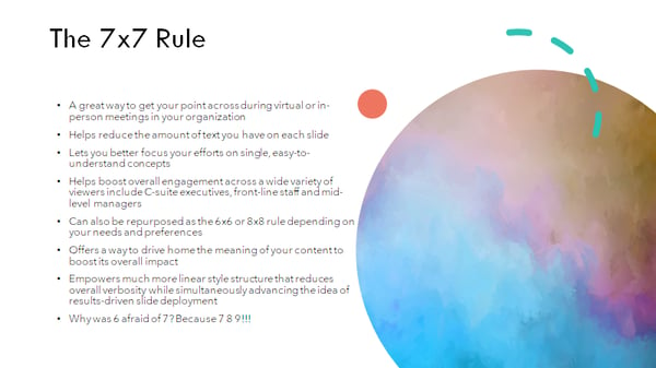
Let’s start with a slide that’s substantially removed from the 7x7 rule:

There’s a lot to unpack here. We’re using too many lines and too many words per line. Lines are complex without saying much, and the attempt at humor doesn’t add anything.
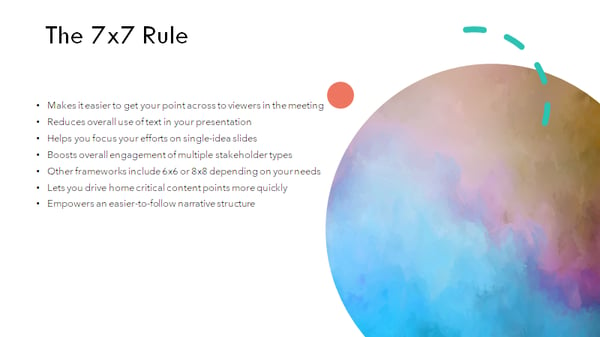
Let’s try again:

This one is better — we’ve reduced the number of lines to 7 and lost the joke, but most of the lines still have more than 7 words and the text is overly convoluted.
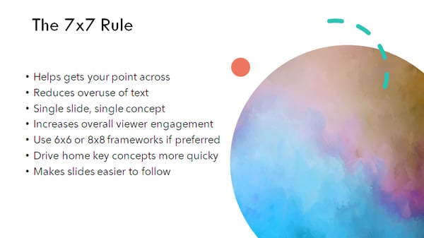
Let’s try one more time:

This slide is clear and concise, and most lines have less than 7 characters. It offers the same information as the first two versions — it’s just more effective and efficient.
The 7x7 Solution
While using 7 lines of text with 7 words or less isn’t a silver bullet for all PowerPoint-related problems, it’s a good place to begin if you’re looking to boost viewer engagement and limit fatigue.
Bottom line? PowerPoint isn’t always the ideal format for getting your point across, but if you need to create a quick-hitter presentation that lands well with your audience, start with the 7x7 solution.
from Marketing https://ift.tt/3rK5EIP
Comments
Post a Comment